CHOICE CELEBRATIONS REBRANDING
Client: Choice Celebrations
Tools Used: Canva, Google Analytics, SEO Tools, Ecwid, Square
Role: Business Development Manager, Product Designer, Web Designer, Brand Strategist


-
The Problem:
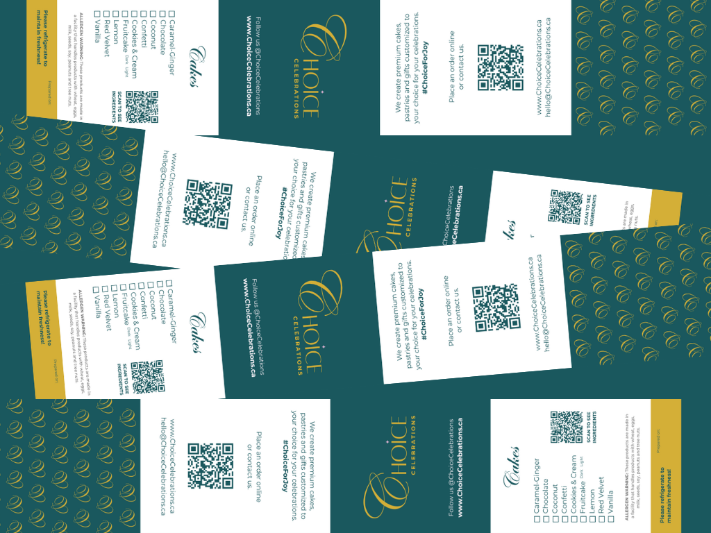
Choice Celebrations needed a new brand identity, one that matched the luxury quality of their cakes and gifts but was approachable for steady sales. The previous site lacked sales and clarity.
My job? Reimagine the entire brand ecosystem: logo, product packaging, website, sales strategy, and customer experience.
The Strategy
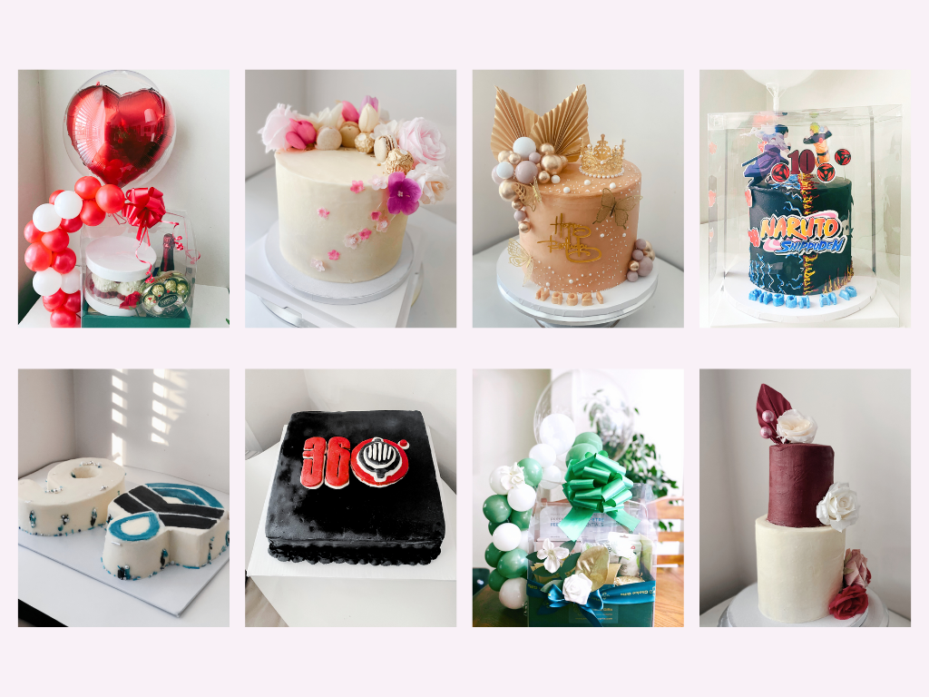
Using a mix of customer feedback and sales data, I led the rebranding and product launch of the now best-selling Choice Collection. Choice Collection is a curated sampler box that converts browsers into buyers. This product became an entry point to higher-ticket cake orders and B2B partnerships.
The new website, built from scratch and optimized for mobile, made navigation intuitive and ordering seamless. I tested sales methods in person at markets (A/B testing packaging, flavours, copy) while running digital campaigns through email marketing and SEO.
The Reviews Are In:
Sales increased by 2000%, growing from under 10 monthly orders to hundreds.
The Choice Collection directly led to an uptick in cake and corporate orders.
The visual rebrand now feels aligned with the brand’s values of luxury, joy, and community.
The brand is thriving, and I continue to consult as the business expands into new markets and products.
UNIVERSITY CLUB MERCHANDISE DESIGN
Client: University of British Columbia’s African Caribbean Students’ Club
Tools Used: Photoshop, Canva
Role: Product Designer, Marketer, VP Internal
-
The Problem:
We needed to gather money early in the school year to fund events.
Our members came from varied cultural backgrounds, and we wanted everyone to feel special while included.
The previous year’s merchandise led to waste. We needed a better approach.
The Strategy:
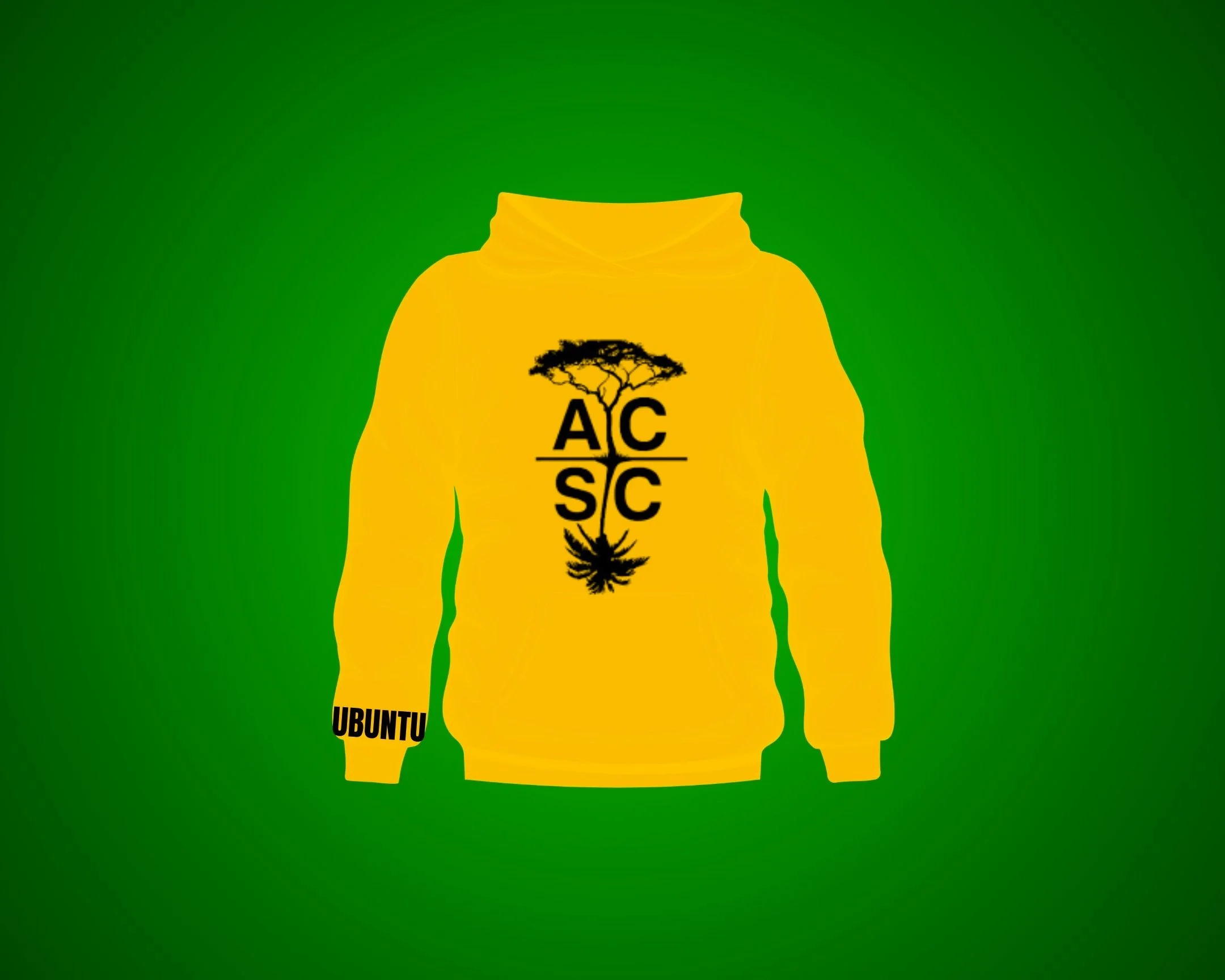
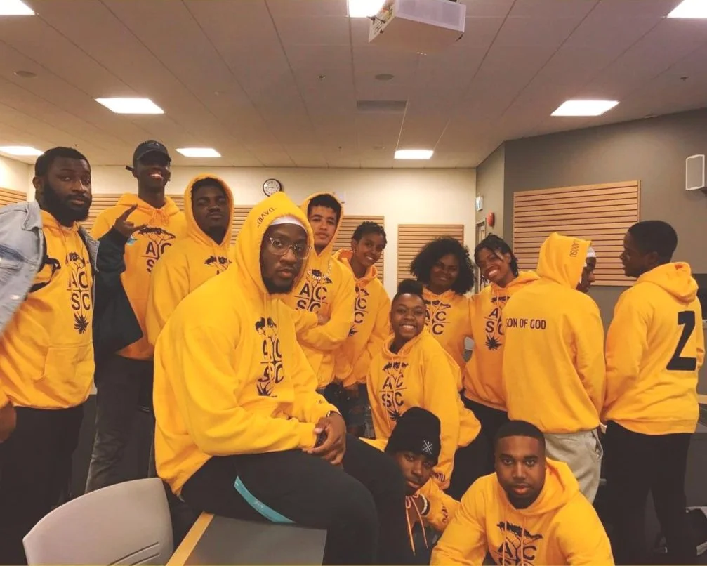
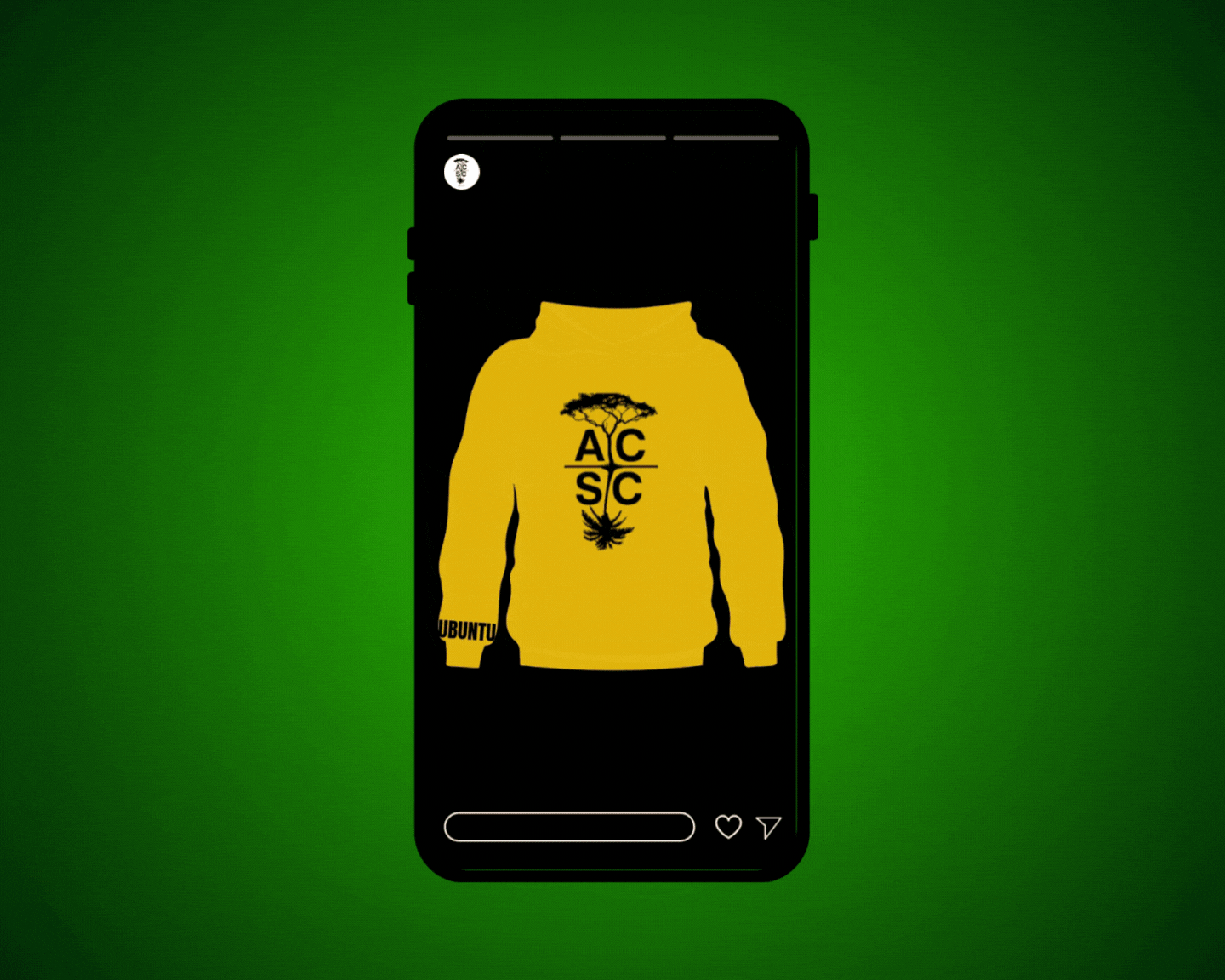
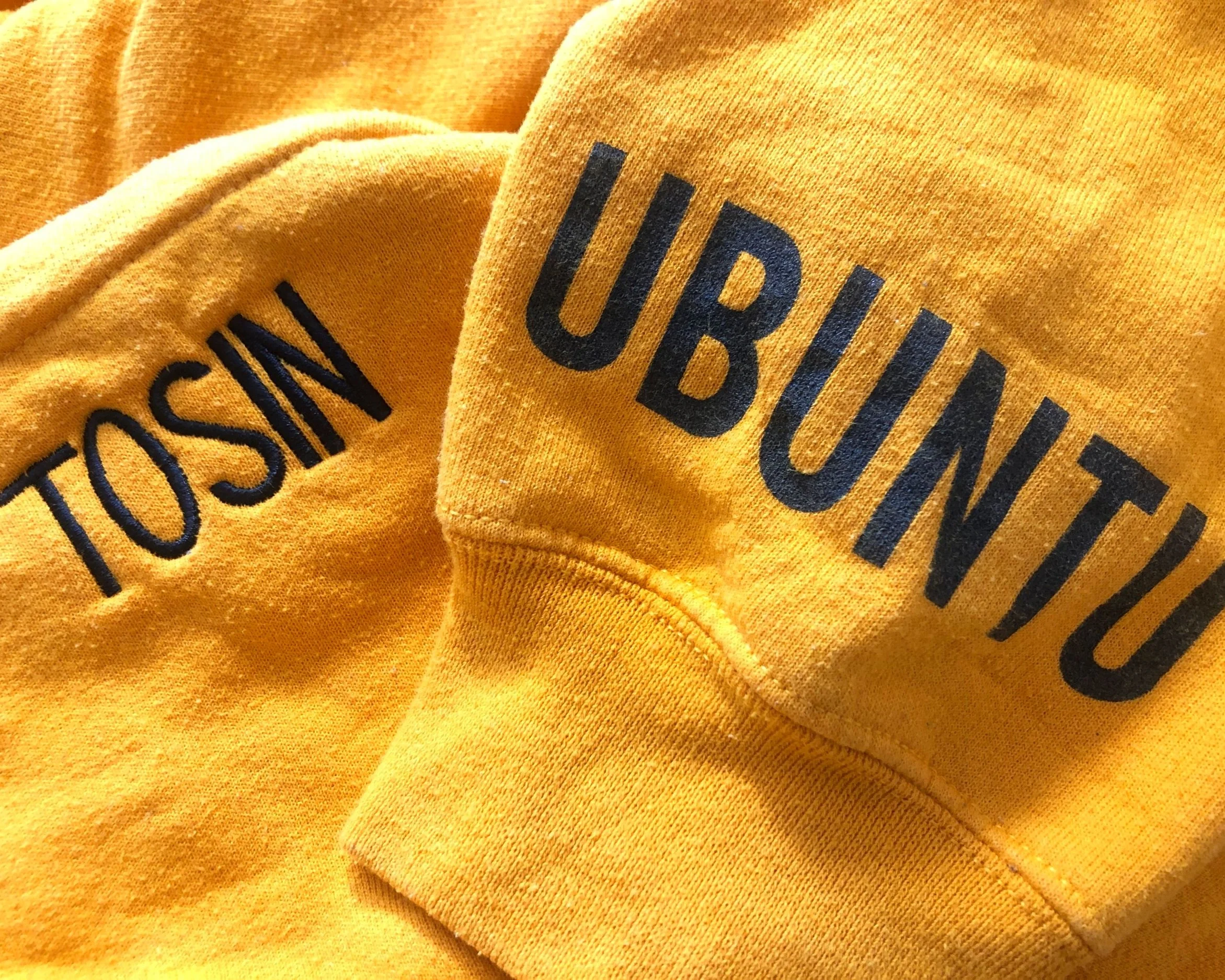
We selected golden yellow hoodies that were synonymous with Beyoncé’s viral Coachella performance that year, as many of us were inspired by the HBCU culture represented. The word “Ubuntu,” a Zulu phrase meaning “I am because we are,” was added to the wrist and served as a reminder of collective identity. Each hoodie included optional personalized details, like custom names on the hood and a design on the back, similar to sports jerseys.
I researched peak sales periods on campus by speaking with the bookstore, and found our launch window: club sign-up week.
I created a few hoodie prototypes and tested them with executive members. The response was overwhelmingly positive. I built anticipation with a social media teaser using Beyoncé’s Coachella version of O.T. Genesis’s “Everybody Mad.” The vibe caught on and students were hyped.
We launched two limited preorder windows to create scarcity and eliminate waste.
This strategy included design, social psychology, and community engagement.
The Reviews Are In:
100+ hoodies sold, with a membership of just 250.
Orders came from students, alumni, and even outside the university.
There was zero leftover inventory, and the following executive team revived the campaign the next year in red.
The hoodie became a symbol. A wearable story of unity and pride.